Direct Mail Strategies of Bed Bath and Beyond
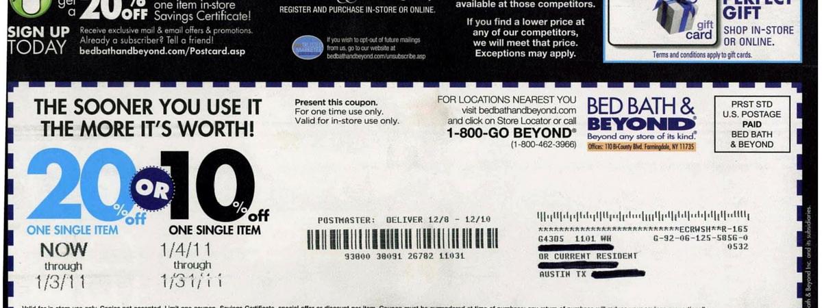
Every month I see a Bed Bath & Beyond direct mail postcard land in my mailbox. I’ll glance at it for a second, flipping the card from front to back, before tossing it in the trash. Like many direct mail recipients, I try to make a snap decision as to whether a particular piece of mail is important or relevant to me and my needs. And, in looking at the most recent Bed Bath & Beyond postcard delivered to me, all I could see was a cluster of marketing messages mixed with multiple calls to action.
As a marketer, I view that postcard as nothing more than a wasted opportunity and an inefficient use of marketing dollars. There is hope, however, for Bed Bath and Beyond or any company, to turn a direct mail mess into a clear, concise, relevant, and cost-effective marketing communications piece.
Deconstructing Bed Bath & Beyond Postcards
Upon review of their postcard, I noticed several missed opportunities to:
- provide relevant content
- track the performance of individual promotions
- collect key data that could aid in refining future messages
- or to generate additional revenue via co-marketing
Here’s a breakdown of some issues to overcome along with a few recommendations for improvement.
Problems: Message Overload, Cluttered Design, No Personalization, No Tracking
I was able to count up to five action requests and three other marketing messages. That’s eight things for the consumer to process—all on one postcard! Just about all of them lacked relevancy to me, a past customer, or a way to track performance.
Message #1: Subscribe to email list or tell a friend to subscribe
The URL to the email registration page is not personalized or uniquely matched with the recipient’s physical mailing address. Once on the registration page, consumers are required to type in their mailing address in order to join the email subscription list. This is a negative because the more information required, the less likely consumers are to complete the form.
Recommendation: Use QR codes or PURLs along with unique key codes to lead recipients to a simple sign-up form. The data included in the PURLs or QR codes can be used to pre-populate form fields, reducing the actions required to subscribe. Additionally, by using these technologies, marketers will be able to measure traffic to the form from the postcard even if the consumer does not follow through with subscribing to the email list.
Message #2: Register for and/or purchase from the Bridal & Gift Registry
This call to action is randomly placed on the postcard and lacks any mechanism to track registrations or purchases made in response to the card.
Recommendation: Consider limiting the use of this call to action, including it only on mail pieces intended to drive bridal registrations and purchases. Use a PURL to drive traffic to more information online.
Message #3: Go online to opt-out from receiving future postcard mailings
It’s great that Bed Bath & Beyond is helping to reduce waste by following the DMA’s recommendation to provide a way for consumers to opt-out of future postcard mailings. However, the actual page online where one can opt out is cluttered and confusing.
Recommendation: Direct recipients to a simple landing page that makes it easy for them to complete an action.
Message #4: Go online or call to find locations nearest you
New technological advances in variable data printing allow marketers to include content on printed collateral that is unique to each recipient… like a map of the nearest store location.
Recommendation: Provide a unique QR code or SMS text marketing element on printed postcards enabling consumers to have driving directions to the nearest store location delivered to their mobile device. It’s trackable and convenient.
Message #5: Bring coupon into physical location to redeem one of two offers
This staple offer for Bed Bath & Beyond is, at this point, integrated into their business model. But, they’re missing an opportunity to potentially develop an auxiliary revenue stream by working with a supplier to feature a product on which the consumer can use their coupon. Additionally, a colorful image of a product could be useful in capturing the recipient’s attention and getting them interested in seeing what other products the store has to offer.
Recommendation: Feature a product or two on the postcard and include a QR code that enables the consumer to make a purchase instantly via their mobile phone.
Message #6: Gift cards available
In my opinion, this is a misplaced message that can confuse or frustrate consumers. Including the message so prominently on this postcard implies that the discount offer may be used to purchase gift cards. If consumers read the lengthy terms of the offer, they’ll discover that “the discount cannot be applied to gift cards…”
Recommendation: Don’t include this message on the card.
Message #7: Competitor’s coupons are accepted
This is a great message to feature. It’s just misplaced.
Recommendation: Reconsider the placement and font treatment.
Message #8: Price-match guarantee
This is also a great message to feature. Coupled with the above message, however, and displayed in a bold white font against a black background, the two messages become a big block of blah.
Recommendation: Reconsider the placement and font treatment.
Some may argue that nothing is wrong. Some may note that the retailer has been using postcards and discount promotions in this way for years; therefore, there is some evidence that it’s working. I’ll respond by saying, without any tracking capabilities other than scanning the card when consumers bring it into the physical store location, it’s impossible for Bed Bath & Beyond to truly understand the cost per acquisition or per promotion. To me, and many marketers out there, that’s evidence of marketing dollars going down the drain.
Watch this quick, 3-minute video to see how marketing agencies can blend digital technologies with direct mail and print to track campaign elements, collect valuable data and generate ROI metrics.
Share to:
